Fintech
Revamping the mobile banking dashboard
Revamping the mobile banking dashboard
Revamping the mobile banking dashboard
Revamping the mobile banking dashboard
In this case study, we tackled the challenge of enhancing content search, making it smarter and more efficient.
As content demands grow, the challenge of finding the right material for the right audience increases. A truly effective search system goes beyond keywords—it intelligently uses tags, descriptions, and contextual information to deliver relevant results that match both the content type and the user's current tasks, providing more meaningful recommendations.
View prototype


Position
Position
Lead Product Designer
Lead Product Designer
Lead Product Designer
Lead Product Designer
Timeline
Timeline
Oct 2020 - Nov 2020
Oct 2020 - Nov 2020
Oct 2020 - Nov 2020
Oct 2020 - Nov 2020
Type
Type
Banking app
Banking app
Banking app
Company
Company
Fusion Digital
Fusion Digital
Fusion Digital
Fusion Digital
My role
My role
My role
As the Lead Product Designer, I was responsible for:
Conducting extensive UX research, including user interviews, competitive analysis, and feedback analysis.
Leading design sprints to conceptualise and develop the dashboard's enhanced functionality.
Developing low-fi and hi-fi wireframes and mockups, focusing on widget-based designs that added value to users and the bank.
Collaborating with cross-functional teams to ensure that the design aligned with technical feasibility and bank business goals.
Lead UX Designer, overseeing design research, user experience, and user interface design.
Collaborated closely with cross-functional teams to craft both technical and user-centered design strategies that aligned with business objectives and user needs.
Spearheaded iterative testing and refinement cycles, ensuring continuous feedback loops and seamless integration of real-time user insights to optimize the final design.
As the Lead Product Designer, I was responsible for:
Conducting extensive UX research, including user interviews, competitive analysis, and feedback analysis.
Leading design sprints to conceptualise and develop the dashboard's enhanced functionality.
Developing low-fi and hi-fi wireframes and mockups, focusing on widget-based designs that added value to users and the bank.
Collaborating with cross-functional teams to ensure that the design aligned with technical feasibility and bank business goals.
Impact
Impact
Impact
25%
Increase in dashboard interaction
Increase in dashboard interaction
40%
Faster access to key features
Faster access to key features
20%
Decrease in negative app reviews
Decrease in negative app reviews
Background
Background
Background
The Mobile Banking Dashboard was a white-labeled platform developed at Fusion, serving 17 financial institutions. Key clients included Bank Australia, Beyond Bank, Defence Bank, Qudos Bank, People's Choice Credit Union, and Unity Money.
The platform was designed to enhance user experiences through customisable dashboards, real-time account monitoring, and transactional tools. The redesign aimed to standardise the user interface while allowing financial institutions to offer tailored, branded services, providing a seamless and efficient mobile banking experience across a diverse client base.
Problem
Problem
Problem
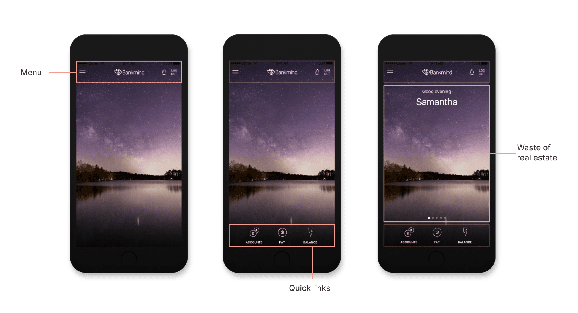
The original dashboard offered little value beyond aesthetic appeal, utilising large images and banners without functionality. The prime real estate was under utilised, which negatively impacted both user experience and engagement. Key issues we identified included:
Lack of meaningful widgets and quick access features.
Poor customisation options for users to personalise the dashboard.
Missed opportunities to display important banking information such as transactions, balances, or personalised offers.
Key questions addressed
Key questions addressed
Key questions addressed
What critical information do users want on the dashboard?
How do we provide customisation without complicating the interface?
Can the APIs support the newly proposed widgets?
What critical information do users want on the dashboard?
How do we provide customisation without complicating the interface?
Can the APIs support the newly proposed widgets?
What critical information do users want on the dashboard?
How do we provide customisation without complicating the interface?
Can the APIs support the newly proposed widgets?


/ Above / A view of the old dashboard and key issues
/ Above / A view of the old dashboard and key issues
/ Above / A view of the old dashboard and key issues
Research insights
Research insights
Research insights
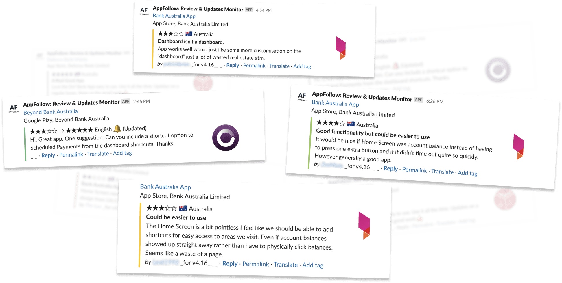
Through user interviews and analyzing app store reviews, we found:
70% of users wanted quick access to account balances and recent transactions.
Users expressed frustration with the limited functionality of the dashboard, seeking widgets that provided more personalised control.
Banks missed opportunities to offer native promotions and personalised offers directly on the dashboard.
Docurated was built over 10 years ago, when dynamic real-time suggestions weren't common. However, by 2019, users expected this functionality.
Quark's customers had seen the benefits of these features on other platforms. It made sense to research how other solutions handling large, complex datasets used search suggestions to simplify content discovery.
Google's search experience shows a good balance of search history, direct matches and smart suggestions.
Outlook's search experience finds matches from a priortized assortment of facets.


/ Above / User's reviews on the dashboard for the Mobile banking dashboard
/ Above / User's reviews on the dashboard for the Mobile banking dashboard
/ Above / User's reviews on the dashboard for the Mobile banking dashboard
Competitor analysis
Competitor analysis
Competitor analysis
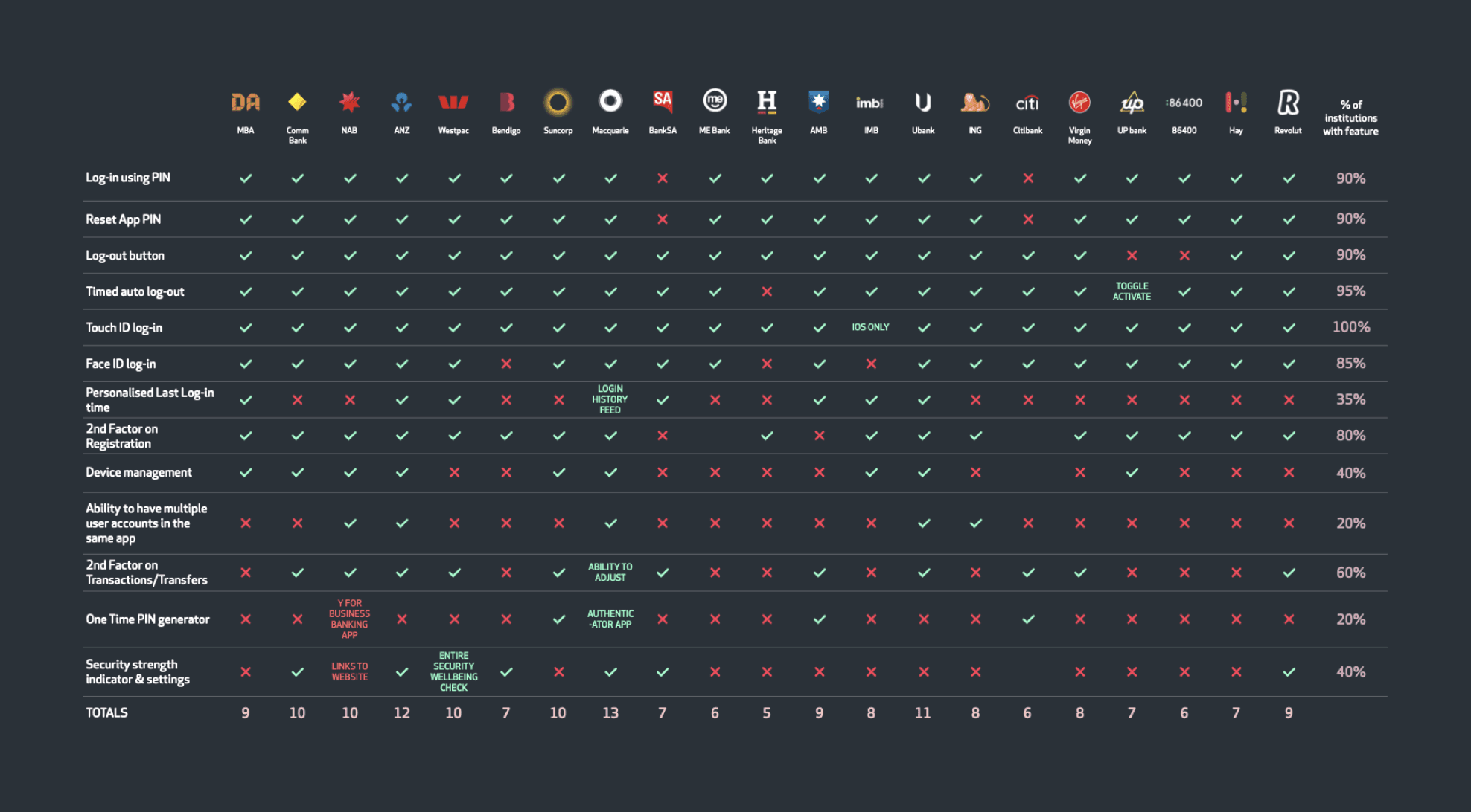
We conducted a thorough competitor analysis focusing on how users logged into various mobile banking apps and what the first screen—usually the dashboard—offered them. This comparison helped identify the core features that users expected upon entry, such as balance overviews, quick payment options, and personalised widgets.
We evaluated the efficiency of these features and the ease with which users could perform essential tasks right from the dashboard, guiding the enhancements we needed for a more intuitive, user-centered design in our product.
Docurated was built over 10 years ago, when dynamic real-time suggestions weren't common. However, by 2019, users expected this functionality.
Quark's customers had seen the benefits of these features on other platforms. It made sense to research how other solutions handling large, complex datasets used search suggestions to simplify content discovery.
Google's search experience shows a good balance of search history, direct matches and smart suggestions.
Outlook's search experience finds matches from a priortized assortment of facets.


/ Above / Snapshot of the competitor analysis with some of the leading banks
/ Above / Snapshot of the competitor analysis with some of the leading banks
/ Above / Snapshot of the competitor analysis with some of the leading banks
Solution
Solution
Solution
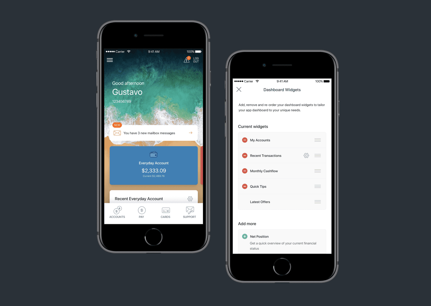
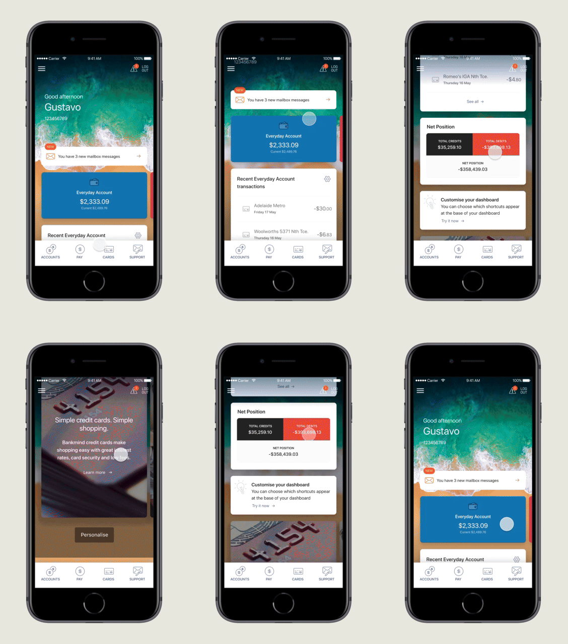
The enhanced dashboard introduced several customizable widgets that allowed users to improve their experience by personalizing the dashboard according to their needs. Each widget, such as account balance overviews, recent transactions, and quick tips, provided easy access to essential features right from the dashboard. This allowed users to interact with key financial data and make quick decisions without navigating multiple screens.
The enhanced dashboard introduced several customizable widgets that allowed users to improve their experience by personalizing the dashboard according to their needs. Each widget, such as account balance overviews, recent transactions, and quick tips, provided easy access to essential features right from the dashboard. This allowed users to interact with key financial data and make quick decisions without navigating multiple screens.
The enhanced dashboard introduced several customizable widgets that allowed users to improve their experience by personalizing the dashboard according to their needs. Each widget, such as account balance overviews, recent transactions, and quick tips, provided easy access to essential features right from the dashboard. This allowed users to interact with key financial data and make quick decisions without navigating multiple screens.


/ Above / redesigned dashboard design for the banking app
/ Above / redesigned dashboard design for the banking app
/ Above / redesigned dashboard design for the banking app
Logged in view
Logged in view
Logged in view
New secure mail message notification
New secure mail message notification
New secure mail message notification
Account cards : This will have to be ALL accounts (since Quick Balances won’t show colours/icons)
Account cards : This will have to be ALL accounts (since Quick Balances won’t show colours/icons)
Account cards : This will have to be ALL accounts (since Quick Balances won’t show colours/icons)
Recent transactions : Users would need to choose a single account that they want to see the 3 most recent transactions for (selectable via the cog icon)
Recent transactions : Users would need to choose a single account that they want to see the 3 most recent transactions for (selectable via the cog icon)
Recent transactions : Users would need to choose a single account that they want to see the 3 most recent transactions for (selectable via the cog icon)
Net position : Overall status across all accounts
Net position : Overall status across all accounts
Net position : Overall status across all accounts
Quick tips : Cards that highlight app features can be hard coded in with logic – no DA involvement required e.g. user hasn’t setup Quick Balances, so show Quick Balance card. Could potentially be stacked so user can swipe horizontally through them
Quick tips : Cards that highlight app features can be hard coded in with logic – no DA involvement required e.g. user hasn’t setup Quick Balances, so show Quick Balance card. Could potentially be stacked so user can swipe horizontally through them
Quick tips : Cards that highlight app features can be hard coded in with logic – no DA involvement required e.g. user hasn’t setup Quick Balances, so show Quick Balance card. Could potentially be stacked so user can swipe horizontally through them
Ad cards : Take the place of the current ads that users can view by swiping right on the dashboard background. Moving them here makes them more discoverable. This format means no additional involvement from FIs. In the future we’d like to investigate moving to a format that is more like “Latest News” cards, that are more compact.
Ad cards : Take the place of the current ads that users can view by swiping right on the dashboard background. Moving them here makes them more discoverable. This format means no additional involvement from FIs. In the future we’d like to investigate moving to a format that is more like “Latest News” cards, that are more compact.
Ad cards : Take the place of the current ads that users can view by swiping right on the dashboard background. Moving them here makes them more discoverable. This format means no additional involvement from FIs. In the future we’d like to investigate moving to a format that is more like “Latest News” cards, that are more compact.


/ Above / quick balance view when logged out
/ Above / quick balance view when logged out
/ Above / quick balance view when logged out
Logged out view
Logged out view
Logged out view
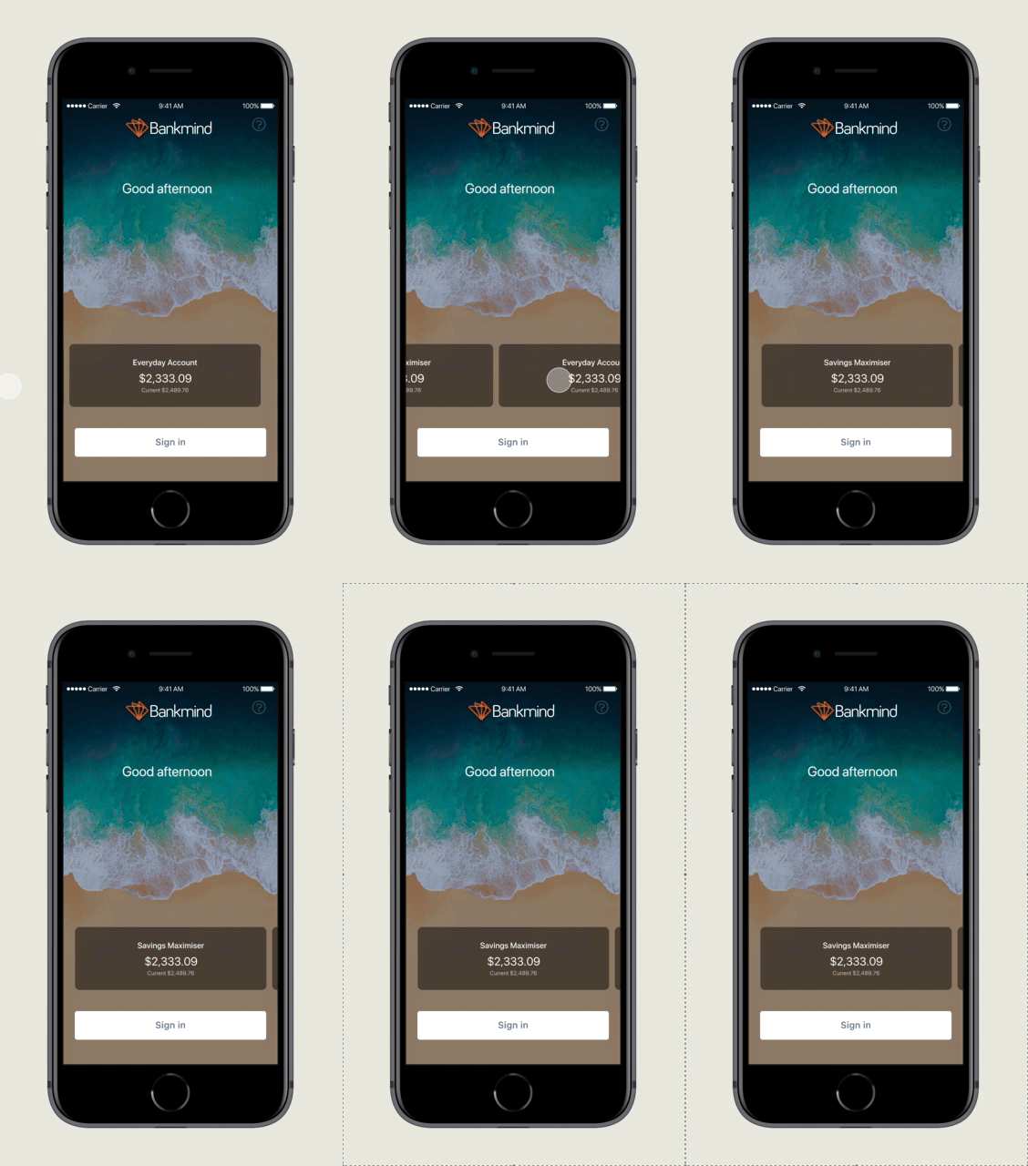
Gives access to content that doesn’t rely on a login, like products, calculators, help etc.
Same behaviour as current build of app.
Low change = low discomfort.Users can view Quick Balances immediately.
Gives access to content that doesn’t rely on a login, like products, calculators, help etc.
Same behaviour as current build of app.
Low change = low discomfort.Users can view Quick Balances immediately.
Gives access to content that doesn’t rely on a login, like products, calculators, help etc.
Same behaviour as current build of app.
Low change = low discomfort.Users can view Quick Balances immediately.
Dashboard customisation
Dashboard customisation
Dashboard customisation
The dashboard customization allowed users to take control of their financial experience by providing the flexibility to arrange it according to their preferences. Users could manage which widgets they wanted to display, ensuring quick access to their most-used features. This functionality catered to varying user needs, whether they wanted to focus on transaction histories, account overviews, or specific tools like savings goals. By enabling such personalization, the dashboard enhanced the overall user experience, making it not just functional but tailored to individual preferences.
The dashboard customization allowed users to take control of their financial experience by providing the flexibility to arrange it according to their preferences. Users could manage which widgets they wanted to display, ensuring quick access to their most-used features. This functionality catered to varying user needs, whether they wanted to focus on transaction histories, account overviews, or specific tools like savings goals. By enabling such personalization, the dashboard enhanced the overall user experience, making it not just functional but tailored to individual preferences.
The dashboard customization allowed users to take control of their financial experience by providing the flexibility to arrange it according to their preferences. Users could manage which widgets they wanted to display, ensuring quick access to their most-used features. This functionality catered to varying user needs, whether they wanted to focus on transaction histories, account overviews, or specific tools like savings goals. By enabling such personalization, the dashboard enhanced the overall user experience, making it not just functional but tailored to individual preferences.


/ Above / dashboard widgets screen
/ Above / dashboard widgets screen
/ Above / dashboard widgets screen
Widget settings
Widget settings
Widget settings
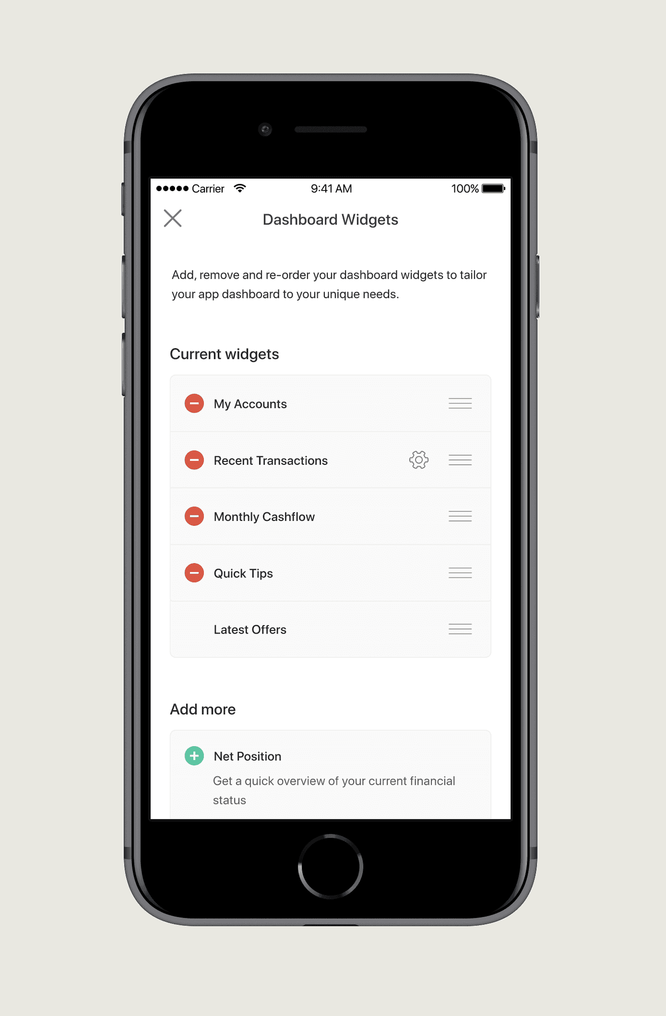
Users can add, remove and re-arrange their widgets. This allows them to personalise their dashboard to meet their unique needs.
A list of active widgets displays at the top in the “Current widgets” section, where users can drag to re-arrange them into their preferred order.
If any widget have associated settings, they can also be accessed here via the cog icon.
Tapping the red delete icon removes the widget from the dashboard, and it join the list below.
Future oriented
Future oriented
Future oriented
The flexibility and modularity of the redesigned dashboard have opened the door for future possibilities, allowing the seamless integration of additional widgets over time. This adaptability ensures that as user needs evolve, the platform can continue to expand its offerings without disrupting the overall experience, providing users with even greater control and functionality in their financial management.
The flexibility and modularity of the redesigned dashboard have opened the door for future possibilities, allowing the seamless integration of additional widgets over time. This adaptability ensures that as user needs evolve, the platform can continue to expand its offerings without disrupting the overall experience, providing users with even greater control and functionality in their financial management.
The flexibility and modularity of the redesigned dashboard have opened the door for future possibilities, allowing the seamless integration of additional widgets over time. This adaptability ensures that as user needs evolve, the platform can continue to expand its offerings without disrupting the overall experience, providing users with even greater control and functionality in their financial management.


/ Above / dashboard widgets screen
/ Above / dashboard widgets screen
/ Above / dashboard widgets screen
Upcoming features
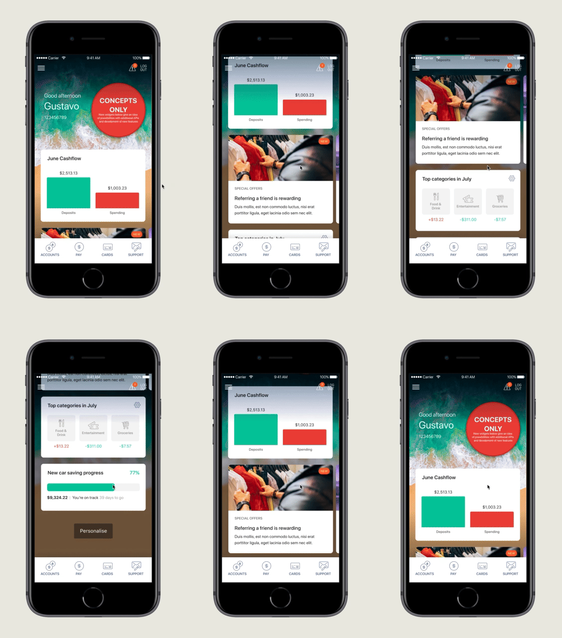
The flexible framework opens possibilities for future widget additions.
New widgets could include advanced financial analytics, personalised savings plans, and investment trackers.
The modular design allows seamless integration of new tools without disrupting the user experience.
As users' financial needs evolve, the platform can easily adapt and grow. This ensures continuous innovation and scalability, keeping the platform relevant.
The dashboard remains future-proof, offering users personalised insights and tools that evolve with their needs.
Results
Results
Results
1
It’s good for banks
It’s good for banks
It’s good for banks
Positions you as helpful and flexible. “Native” promotions placed amongst dashboard widgets should be more effective.
Positions you as helpful and flexible. “Native” promotions placed amongst dashboard widgets should be more effective.
Positions you as helpful and flexible. “Native” promotions placed amongst dashboard widgets should be more effective.
2
Improved contextual search
Searching within a certain view prioritizes content in that context before considering additional parameters.
Searching within a certain view prioritizes content in that context before considering additional parameters.
3
Support for power-users
It is now possible for power-users to search specifically within a particular search paremeter.
It is now possible for power-users to search specifically within a particular search paremeter.
2
It’s good for customers
It’s good for customers
They get the info they want and can accomplish tasks faster. Less time searching, more time doing.
They get the info they want and can accomplish tasks faster. Less time searching, more time doing.
3
A win-win situation
A win-win situation
The enhanced dashboard introduced features that benefit both the banks and the customers and on top of that, it is the doorway to heaps of opportunities.
The enhanced dashboard introduced features that benefit both the banks and the customers and on top of that, it is the doorway to heaps of opportunities.
Looking for a designer who can elevate your product with smart, user-centered solutions?
Looking for a designer who can elevate your product with smart, user-centered solutions?
Looking for a designer who can elevate your product with smart, user-centered solutions?
Let’s work together to create something impactful.
Let’s work together to create something impactful.
Let’s work together to create something impactful.
